Landing Page
2025
Designing outbound experiences that convert curiosity into qualified conversations
Lumix reimagines LinkedIn outbound through a conversion-focused experience that builds trust, simplifies complex workflows, and encourages confident action.
Overview
Designing a buyer journey that builds trust before the first conversation
Lumix is a B2B outbound platform designed to help sales teams automate prospecting, identify high-intent leads, and personalize outreach at scale. This concept redesign focused on transforming a feature-heavy marketing website into a structured buying experience—helping potential customers understand the product, evaluate its value, and confidently move toward booking a demo.
The Impact
The redesign focused on reducing decision friction by restructuring the page around how modern B2B buyers evaluate software. Through clearer messaging, stronger visual hierarchy, authentic product demonstrations, and strategically placed trust signals, the experience helps visitors understand the platform faster while guiding them naturally from discovery to conversion.
Problem
Great outreach wasn't the problem - fragmented workflows were.
Modern sales teams weren't losing opportunities because they lacked effort. They were losing momentum because prospect research, campaign management, approvals, and follow-ups lived across disconnected tools. Reconstructing customer context before every interaction became part of the workflow, slowing response times, creating inconsistent outreach, and making it difficult for teams to maintain meaningful conversations at scale.
01 – Collect intent signals, 02 – Transform insights into outreach, 03 – Guide prospects through every interaction.
Research
Understanding the workflow behind every missed opportunity
Rather than evaluating individual product capabilities, this exploration focused on understanding how modern sales teams navigate outbound workflows. By mapping buyer journeys, analyzing existing outreach platforms, and synthesizing workflow patterns, the research uncovered where context was fragmented, follow-ups lost momentum, and operational visibility became increasingly difficult as customer interactions scaled.
What I learned
The strongest pattern wasn't a lack of automation: it was a lack of visibility. Every workflow revealed the same underlying challenge: sales teams spent more time reconstructing context than maintaining conversations. Opportunities slowed not because follow-ups were forgotten, but because the next meaningful action was rarely surfaced at the moment it mattered most.
"What impressed me wasn't the redesign itself, It was how Riyan reframed the problem. Instead of focusing on features, he focused on how buyers make decisions. That shift fundamentally changed how we presented our product, making the entire experience feel more intuitive, credible, and aligned with our business goals."

Founder, Lumix
Kristen Guevara
Ideation
Designing the story before designing the interface
Once the core problem became clear, the focus shifted from arranging sections to designing a buying journey that felt natural. The exploration centered on how visitors discover value, build trust, and move toward a decision. Instead of refining visuals immediately, I tested multiple content structures, section priorities, and interaction patterns to understand which flow communicated the product most effectively.

Early wireframes exploring content hierarchy, section sequencing, and conversion-focused layouts before refining the final experience.
Testing interaction flows early
Early concepts focused on how users progressed through the page instead of how individual sections looked. By iterating on layout, navigation, and section order, the design evolved into a more cohesive experience where every component supported the next stage of the buyer's decision-making process.
Designs
Designing every section to answer the buyer's next question
Rather than treating each section as an independent marketing block, the experience was designed as a continuous decision-making journey. Product demonstrations, comparisons, customer proof, and calls-to-action were carefully sequenced so visitors always understood what the product does, why it matters, and what to explore next. This created a smoother experience while reducing the cognitive effort required to evaluate the platform.
Key sections of the final experience, including product demonstrations, customer proof, feature comparisons, and conversion touchpoints designed to guide buyers from discovery to action.
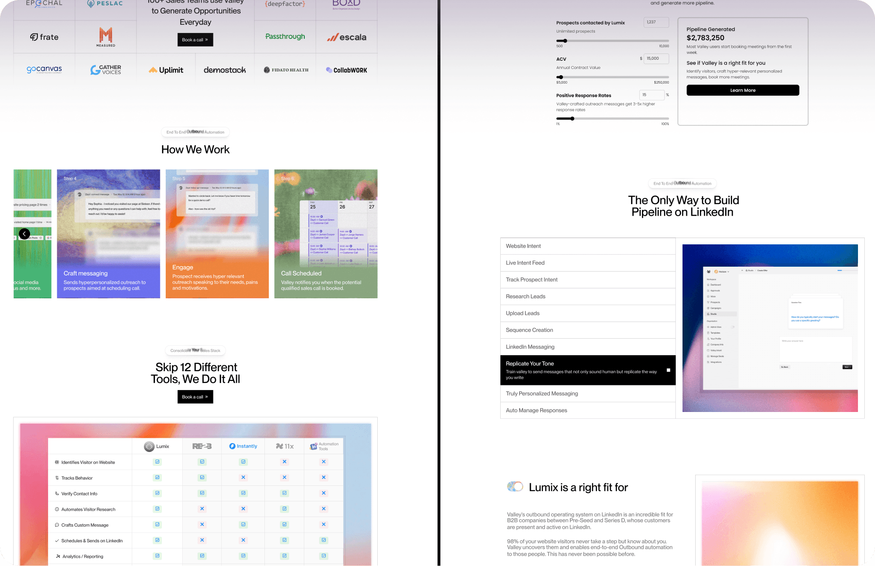
Rather than showcasing isolated features, the experience illustrates how every capability contributes to a connected sales journey. Prospect research, AI-assisted messaging, workflow automation, performance insights, and customer proof are presented as one continuous system, making it easier for buyers to understand how Lumix fits into their daily operations.
Every design decision focused on reducing the effort required to understand the platform. Instead of introducing features in isolation, the experience combines product context, real interface previews, and meaningful workflows into one cohesive narrative that helps visitors quickly recognize how Lumix fits into their existing sales process.
Lessons
Products become easier to use when decisions become easier to make.
This project shifted my perspective from designing interfaces to designing decision-making experiences. Every layout, interaction, and content hierarchy should help users answer a question faster and move forward with confidence. Rather than simplifying the product itself, the real challenge was simplifying how people understood it. That mindset continues to influence how I approach every product I design today.
