Landing page
2026
Designing a destination people can't wait to experience
A destination discovery and booking experience that helps visitors explore attractions, choose the right passes, and plan memorable trips with confidence.
Overview
Designing a visitor journey that starts before the adventure
Planning a memorable day shouldn't require navigating scattered information. Wildora brings attractions, ticket options, park highlights, and visitor guidance together in one cohesive experience that helps guests prepare before they arrive.
The Impact
The final experience balances inspiration with practical decision-making. Rich visuals encourage exploration, while structured content and intuitive navigation make booking faster and more confident for first-time visitors.
Problem
Visitors shouldn't have to work to understand the experience.
Every unanswered question creates hesitation. Which pass should I choose? What attractions are included? Is this suitable for my family? The interface needed to answer these questions naturally through content hierarchy rather than forcing visitors to search for information.
Visitors could see what Wildora offered, but understanding which experiences matched their interests required unnecessary exploration.
Research
Discovering what gives visitors confidence to book
Every insight pointed toward the same challenge. Visitors needed reassurance before making a decision. Questions about attractions, ticket options, family suitability, and value shaped nearly every stage of the planning journey, making confidence a stronger design priority than simply providing more content.
What I learned
The biggest challenge wasn't presenting information. It was removing uncertainty. Visitors wanted quick answers about attractions, ticket options, and what suited their group. Designing around those decisions created an experience that felt simpler, more trustworthy, and far easier to navigate.
"What stood out wasn't only the visual quality. It was how naturally the experience answered our visitors' questions before they had to ask them. That clarity changed how the entire website feels."

Manager, Wildora
Rahul Varma
Ideation
Designing the visitor journey before refining the interface
Rather than starting with colors and visuals, the exploration began by testing how visitors naturally moved through the website. Different layouts experimented with content hierarchy, section order, and booking touchpoints to understand which journey helped users discover attractions, compare experiences, and book with the least friction. These early concepts established the foundation for every design decision that followed.
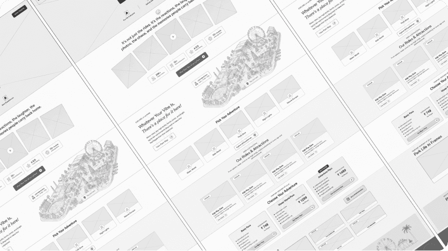
Exploring multiple landing page structures to refine content hierarchy, booking flow, and visitor decision-making before the final UI.
Testing interaction flows early
Instead of validating individual screens, I tested how users moved through the entire experience. The exploration focused on whether visitors could quickly understand the park, discover relevant attractions, compare ticket options, and confidently choose the right pass. The findings guided both the content hierarchy and the final interaction flow.
Designs
Designing every page to move visitors closer to booking
The final experience was built around a simple principle: every screen should answer one question before introducing the next. Attractions, ticket options, visitor stories, and planning tools follow a clear progression that helps people explore with confidence instead of searching for information. Every interaction was designed to reduce uncertainty and make planning a visit feel effortless.
Final interface showcasing a complete visitor journey, from discovery and attraction exploration to ticket selection and trip planning within one cohesive experience.

Introducing the park through immersive storytelling before guiding visitors toward experiences that match their interests.
Designed to reduce decision fatigue by presenting every pass with clear benefits, transparent pricing, and a consistent comparison structure.
Lessons
People don't book attractions. They book experiences they understand.
Beautiful visuals can inspire visitors, but clarity is what helps them make decisions. Throughout this project, every improvement came from reducing uncertainty instead of increasing information. Once the experience focused on guiding visitors rather than showcasing features, the booking journey became significantly more intuitive.
Looking ahead, I'd explore AI-powered trip planning that recommends attractions, ticket combinations, and personalized schedules based on each visitor's preferences.
